
10 spring Instagram colour palettes, with colour codes
By Sara · · 5 min read
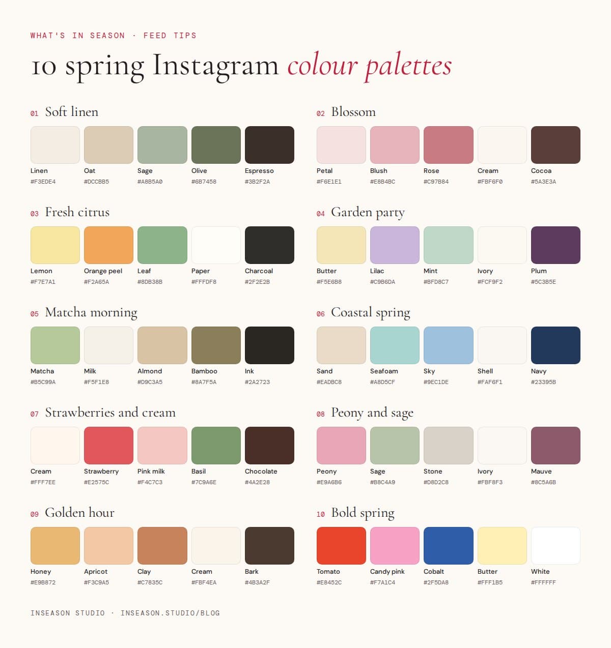
Ten spring colour palettes for Instagram, each with five colour codes you can paste straight into Canva. From soft linen to bold spring brights.
A small, fixed palette is the fastest way to make a feed look designed. It's step two of our guide to making your Instagram feed look cohesive, and the step people most often get stuck on. So here are ten spring palettes to start from, each with five colours and the codes to copy into Canva.
How to use a palette
Each palette has five colours, but you won't use them equally. Pick the lightest as your main background, use two or three for shapes, text blocks and photo choices, and keep the strongest colour as your accent for a highlighted word or a button. In Canva, click any colour, choose the plus sign and paste the code (the six characters after #).
1. Soft linen
Linen #F3EDE4, Oat #DCCBB5, Sage #A8B5A0, Olive #6B7458, Espresso #3B2F2A. Calm and grounded. Best for wellness, slow living, interiors and anyone who wants their feed to feel like a deep breath.
2. Blossom
Petal #F6E1E1, Blush #E8B4BC, Rose #C97B84, Cream #FBF6F0, Cocoa #5A3E3A. Soft and romantic without being sugary. Lovely for beauty, bridal, florists and feminine personal brands.
3. Fresh citrus
Lemon #F7E7A1, Orange peel #F2A65A, Leaf #8DB38B, Paper #FFFDF8, Charcoal #2F2E2B. Bright, energetic and very spring. Works for cafés, juice bars, food brands and lifestyle creators.
4. Garden party
Butter #F5E6B8, Lilac #C9B6DA, Mint #BFD8C7, Ivory #FCF9F2, Plum #5C3B5E. Playful pastels anchored by a deep plum. Great for events, kids' brands, stationery and party season.
5. Matcha morning
Matcha #B5C99A, Milk #F5F1E8, Almond #D9C3A5, Bamboo #8A7F5A, Ink #2A2723. Earthy and fresh. Perfect for cafés and food brands, nutritionists and health coaches.
6. Coastal spring
Sand #EADBC8, Seafoam #A8D5CF, Sky #9EC1DE, Shell #FAF6F1, Navy #23395B. Breezy and clean. Suits travel, swimwear, holiday rentals and any brand near the water.
7. Strawberries and cream
Cream #FFF7EE, Strawberry #E2575C, Pink milk #F4C7C3, Basil #7C9A6E, Chocolate #4A2E28. Sweet but grown-up. Made for bakeries, dessert brands, picnic content and Galentine's-style posts.
8. Peony and sage
Peony #E9A6B6, Sage #B8C4A9, Stone #D8D2C8, Ivory #FBF8F3, Mauve #8C5A6B. Feminine and botanical. A natural fit for Pilates studios and instructors, skin clinics and wellness retreats.
9. Golden hour
Honey #E9B872, Apricot #F3C9A5, Clay #C7835C, Cream #FBF4EA, Bark #4B3A2F. Warm and glowy, like late afternoon light. Beautiful for photographers, candle and home brands, and faceless lifestyle content.
10. Bold spring
Tomato #E8452C, Candy pink #F7A1C4, Cobalt #2F5DA8, Butter #FFF1B5, White #FFFFFF. Confident and graphic. For brands that want to stand out in the feed: fashion, events, creative studios and launches.
Keep it cohesive
Choose one palette and use it for the whole season. Pair it with two fonts that suit its mood and a grid layout you can repeat, and your feed will look planned from the first post.
Questions people ask
How many colours should be in an Instagram palette?
Three to five. Fewer colours make your feed look more intentional, and it's easier to find photos that fit.
How do I add colour codes in Canva?
Select an element, click the colour square, choose the plus sign under Document colours and paste the six-character code. You can do this in free Canva.
Should I change my palette every season?
You can shift it gently each season, but keep your fonts and post types the same so your feed stays recognisable. See the full cohesive feed guide for how.